
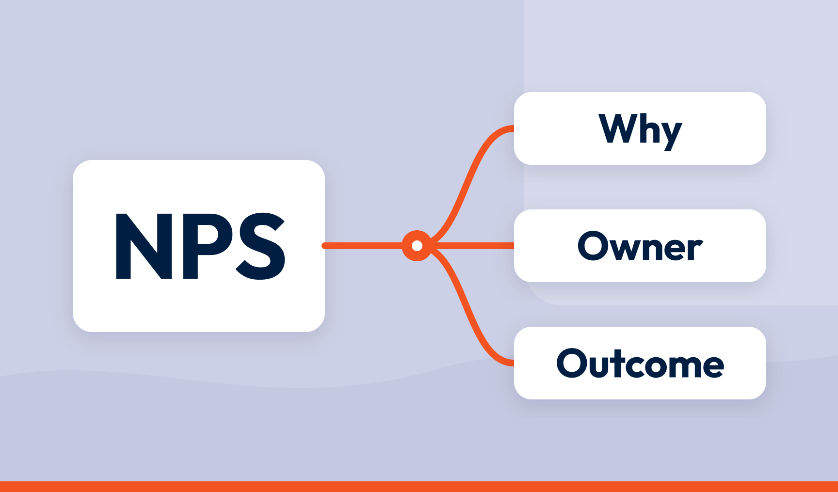
Should you ditch NPS? No. The criticisms of Net Promoter Score® are mostly fair and mostly aimed at the wrong target. NPS fails when it is collected without a follow-up question, reported without segmentation, and never connected to a driver, an owner or a business outcome. Fix the connections and the metric works exactly as it was designed to.
Key takeaways
- Every serious criticism of NPS is a criticism of a score that has been cut off from its context
- The alternatives suffer from exactly the same problems when used the same way
- NPS works when it is connected to five things: the why, the who, the where, the owner and the outcome
- The metric was never the point. What you do next was
- If you are thinking of ditching NPS, ask first whether you ever actually used it
In 2021 a well-known analyst firm predicted that three quarters of organisations would abandon NPS by 2025. The deadline has passed. NPS is still on most dashboards, and the argument about whether it should be is still going.
That argument is a distraction. NPS does not have a design problem. It has a plumbing problem.
The case against NPS
Let’s be fair to the critics, because most of what they say is true.
- It is a single number with no context. A 42 tells you promoters outnumber detractors by 42 points. That is all it tells you
- It means different things in different sectors. A 30 is excellent in insurance and alarming in hospitality, and nobody can tell you where the line is
- It can be gamed. Attach a bonus to it and people will find ways to move it that have nothing to do with the customer. Survey only the happy ones. Ask at the moment of delight. Coach for a 10
- It oversimplifies. A relationship reduced to a 0 to 10 scale loses most of what made it a relationship
- It is biased by who answers. The furious and the delighted respond. Everyone in the middle gets on with their day
- It does not tell you why. ‘How likely are you to recommend us?’ asks for a verdict, not an explanation
Read that list again and notice something. Every item is a complaint about a number that has been separated from everything around it. Not one of them is a complaint about the question.
The same list applies to every alternative
Switch to CSAT and you get a single number with no context, which means different things at different touchpoints, can be gamed, oversimplifies, is biased by who answers, and does not tell you why.
Switch to CES. Same list.
Switch to a bespoke loyalty index you designed yourself. Same list, plus nobody outside the CX team knows what it means.
There is no metric that carries its own explanation. Any score used in isolation is a scoreboard, and swapping one scoreboard for another does not make the team play better. The problem the critics have identified is real. It is just not a problem with NPS.
What disconnected NPS looks like
You will recognise this programme. Once a year, a survey goes out asking the recommend question and nothing else. The score comes back. It gets reported to the board, compared with last year, and coloured green or red. If it is red, a working group is formed. If it is green, a slide is made. Either way, nothing about the experience changes, because nobody knows what to change.
That is not NPS failing. That is a number being collected and then left alone. You could do the same thing to your revenue figures and conclude that accounting doesn’t work.
The five connections that make NPS work
NPS earns its keep when it is wired into five things. Cut any one of them and you are back to the scoreboard.
1. The why
Every score needs a follow-up question. ‘What is the main reason for your score?’ is enough. The wording matters more than people think: ask ‘what is the one thing we could improve?’ and you will get one thing, when the respondent had three.
Then treat the answers as data. Ranked by how much each theme moves the score, and traceable back to the words people used, the comments turn a 42 into ‘delivery delays are the top driver of detractors and they doubled this quarter’. That is a sentence with a fix in it.
2. The who
A company-wide score is an average, and averages are where problems hide. A 42 can be a 60 among long-standing customers and a 20 among people who joined this year. Join every response to what you know about the person who gave it, and the score becomes a map of who is happy, who is drifting, and which of them are worth the most to you.
The non-response criticism belongs here too, turned round. Yes, the people who answer are a sample. That makes them more valuable, not less. Everyone who wrote in about a problem stands for several who hit it and said nothing, and the same is true of praise. Read the sample as a sample and it tells you about the population.
3. The where
One relationship question a year cannot tell you where in the journey the relationship is being won or lost. Ask at the moments that matter, after a purchase, a delivery, a support contact, a renewal, and the detractors stop being a percentage and start being a place. Onboarding is fine. Returns are a disaster. Now you know where to look.
4. The owner
A driver with no owner is a finding. A driver with an owner is a task. When ‘returns process’ tops the detractor drivers, that evidence, with the comments attached, needs to land with whoever runs returns. Not in a deck they might read. In the tool they already work in, with a case number. The same goes for the individual detractor: a 2 from a valuable customer should reach someone who can act on it the same day, not the same quarter.
This is also the answer to the gaming criticism. Bonus people on a number they cannot see the drivers of and they will game the number. Show them the drivers they can actually influence and they will move the drivers.
5. The outcome
Finally, the score has to be connected to something the business already cares about. Detractor rate against churn. Promoter rate against repeat purchase. Driver movement against cost to serve. When NPS sits in the same report as the revenue and retention numbers it is supposed to predict, the ‘so what’ question answers itself. When it sits in a CX tool nobody else opens, the ‘so what’ question is fatal.
Do all five and you have CX intelligence: a score with its reasons, its people, its places, its owners and its consequences attached. Do none of them and you have a mood ring.
Where NPS genuinely is the wrong tool
There are cases where the recommend question itself gets in the way, and honesty requires listing them.
When there is no choice. Nobody recommends a passport office. When recommending is odd, as with some financial products or medical services. When the audience is so niche that ‘recommend to a friend’ makes people laugh. You will know from the comments if this is you, because the answers stop being about the experience.
In those cases, use CSAT or CES for the transactional layer and something else for the relationship. But apply the same five connections, because the alternative metric will fail in exactly the same way without them.
The question is not which metric. It is what happens next.
NPS was designed as one question that predicted whether people would come back, buy more and tell their friends. Twenty years of arguing about the question has obscured the more useful observation: the score was only ever the start of a process, and most organisations stopped at the start.
If your NPS programme is a number on a slide, ditching it will not help, and neither will replacing it. Connect it instead. Ask why. Know who. Know where. Give it an owner. Tie it to an outcome. Then watch what happens to the argument about whether NPS works.
That is what SmartCX is built to do: collect the score and the reason at the moments that matter, rank the drivers, route them to the people who own the fix, and put the result next to the business numbers. See the connections working in our product tour.
Frequently asked questions
Is NPS still relevant?
Yes, when it is connected to the reasons behind the score, the people giving it, the journey stage, an owner and a business outcome. Used as a standalone number it is as limited as any other standalone number.
What are the main criticisms of NPS?
That it lacks context, varies by sector, can be gamed, oversimplifies the relationship, is skewed by who chooses to respond, and does not explain why. All are valid, and all apply equally to any satisfaction metric used in isolation.
Should you replace NPS with CSAT or CES?
Not as a replacement. CSAT and CES are transactional metrics and measure different things: satisfaction with a moment and the effort a task took. Most programmes should run them alongside NPS, collected at touchpoints, with NPS as the periodic relationship measure.
When is NPS not appropriate?
When the recommend question doesn’t make sense to the audience: monopoly or public services, certain financial and medical contexts, and very niche products. The comments will tell you, because the answers stop being about the experience.
How do you make NPS actionable?
Ask why, segment by who is answering, collect at journey stages rather than annually, route the top drivers and individual detractors to the people who own the fix, and report the score alongside churn, retention and revenue. Any one of these helps. All five turn a score into a system.
SmartCX is the VoC platform that helps you turn feedback data into CX intelligence the whole business can act on. Watch the product tour or talk to us about connecting your NPS to something.