
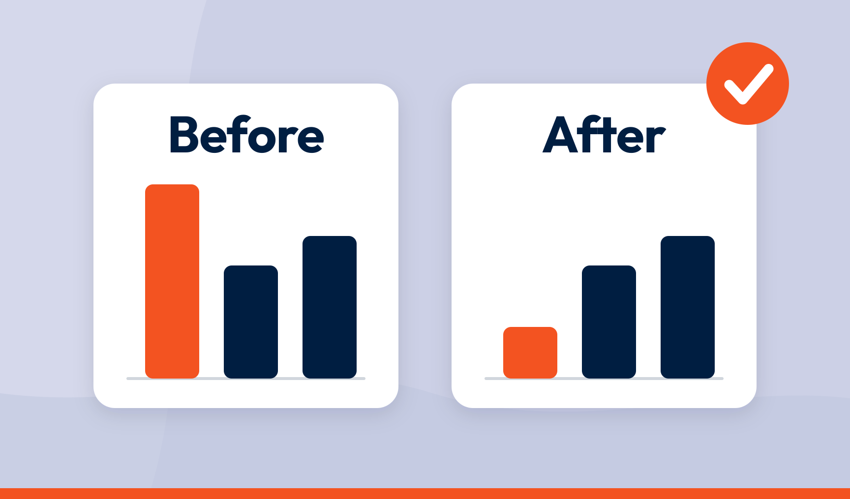
To prove a customer experience fix worked, set a baseline before you change anything, track the same topic in the same way afterwards, and look for three things moving together. Fewer mentions of the problem, better sentiment when it is mentioned, and movement in the score and the business metric it feeds. One of the three is a hint. All three is proof.
Key takeaways
- ‘We think it’s better now’ convinces nobody. A before-and-after on the driver convinces everyone
- Volume falling is not enough on its own. Fewer complaints can mean fewer people getting that far
- The topics you measure against have to mean the same thing before the fix and after it, or you are comparing this quarter’s apples with last quarter’s fruit
- A fix that held for a fortnight is a coincidence with a press release. Give it a quarter
- Proving one fix is how you get the next one funded
You fixed checkout. You know you fixed checkout, because the team spent six weeks on it and the release notes say so. Then someone in the leadership meeting asks how you know it worked, and the honest answer is a feeling.
Most CX teams can say what people complain about. Far fewer can show how those complaints have changed over six months, or that the thing they shipped did anything at all. The difference between ‘we fixed checkout’ and ‘we fixed checkout, complaints about it fell 60%, and repeat purchase on that cohort rose four points’ is the difference between a nod and a budget.
The chart
Picture one chart. Along the bottom, the weeks. Up the side, how many people complained about checkout. A vertical line marks the day your fix went live. To the left of that line, complaints are high. To the right, they fall and stay down.
Now add two more lines to the same chart. One for how people feel when they do mention checkout, which should climb from angry towards fine. One for the number the business cares about, repeat purchase or churn on the people who went through checkout, which should improve a few weeks later. Three lines, all improving after the same date.
That is proof.
Everything else is about making sure the chart is accurate and nobody can pick it apart, and most of that work happens before you fix anything.
Before the fix
Start by being clear about what you are fixing. One person complaining about checkout is an anecdote. Fifty people saying the same thing over three months is a pain point, and pain points are the only things you can prove you fixed, because a pattern has a cause and an anecdote has a mood.
Fixed does not mean the person who complained is happy now. It means the pattern has stopped.
The pattern rarely lives in one place. It shows up in surveys, reviews, complaints, support tickets and the odd furious tweet. If those sit in separate systems, one team sees the problem while another swears it doesn’t exist, and your before-and-after only covers whichever channel you happened to open. Collect feedback across the journey and pull the other sources alongside it, so the whole of one problem sits in one view.
Then make sure the topic you are measuring will still be the same topic in three months. If ‘checkout errors’ is one theme in March and has split into ‘payment problems’ and ‘card declined’ by June, you have no trend, just two different charts with a gap between them.
The categorisation has to hold steady across time and across sources. Consistent automated categorisation does this better than a team of people, because people drift and software doesn’t.
Then record where you are starting from. Note how many people mention the topic each week, the sentiment of those mentions, and where the score and the business metric sit today. Date it and file it before the release ships. That is your baseline, and it has to exist before the fix does. A baseline reconstructed afterwards is a guess with a spreadsheet, and everyone in the room will know.
After the fix
Complaints should fall first, and they are also the easiest signal to misread. Volume drops when a problem is fixed. Volume also drops when fewer people get far enough to hit the problem.
If checkout complaints halved because half your visitors gave up at the basket, nothing has been fixed and something new has broken.
So check complaint volume against the number of people who actually went through checkout, and keep an eye on the next topic along. Fix checkout and complaints sometimes migrate to delivery, because people who used to abandon at the basket are now getting far enough to be let down later.
Sentiment is the second line and the more honest one. People will still mention checkout. The question is whether they now say it was quick rather than a nightmare. Because sentiment is scored on the phrase, someone who praises checkout and slates delivery in the same breath still counts as a win for checkout and a warning for delivery.
Watch the topic’s impact score too. In key driver analysis, every topic gets an impact score based on how many people mention it and how they feel when they do, and the topics with the highest scores are the ones moving your NPS or CSAT. As checkout complaints fall and the sentiment improves, its impact score should fall with them. A fixed problem stops being a driver.
The third line is the one leadership came for. Line the release date up against the score for the people affected, then against the business number. If CSAT at checkout improves in the weeks after the release, and repeat purchase on the same group improves a few weeks after that, you have the chain.
Driver fixed, score moved, revenue followed.
Support tickets about the issue falling at the same time is the operational proof, and finance likes it best because it arrives with a cost saving attached.
Two things will try to spoil the picture.
Several changes usually ship at once, so compare the people who experienced the fix with a group who didn’t, in the same period, and let that comparison make the claim for you.
And the picture takes time to form. Two quiet weeks is not resolution. A quarter is, or two purchase cycles if they are longer. Premature victory laps have a habit of being followed by a very public relapse when the next release reintroduces the bug or the seasonal peak finds the process you thought you had fixed. Set an alert on the topic so a spike reaches the owner the day it happens, not the quarter after.
| Measure | Before the fix | What ‘fixed’ looks like |
|---|---|---|
| Topic volume | Baseline mentions per week | Sustained fall, adjusted for how many people reached that step |
| Topic sentiment | Mostly negative | Shift towards neutral or positive on the same topic |
| Impact score | Among the highest, so a top driver of the score | Falling as volume drops and sentiment improves |
| Score for the affected segment | Baseline CSAT, CES or NPS | Improvement aligned with the fix date, against a comparison group |
| Related support contacts | Baseline tickets per week | Fall in contacts about that issue |
| Business metric | Baseline churn, repeat rate or cost | Movement on the affected cohort within one or two purchase cycles |
Prove the good things too
The same chart works for things you launched, not just things you fixed. A new returns process, a redesigned app, a friendlier greeting at the door. Did anyone notice?
Track the positive topic the same way, mentions and sentiment before and after, and watch whether it turns up among the reasons promoters give for their score. Praise is under-reported, so a modest rise means a much larger group felt the difference.
Proving what worked is how you make the case to do more of it, and it makes a far more cheerful slide than another fixed defect.
One more thing while you are at it. Tell the people who complained. They told you about the problem, so tell them it is gone. It costs nothing, it turns a detractor into someone who has watched you listen, and it is the only part of this entire process a customer ever sees.
Draw the chart where the decisions are made
A before-and-after chart that lives inside your CX tool proves the fix to the CX team. Everyone else gets a screenshot, and screenshots carry no authority.
Put the chart where the decision-makers already look, in the built-in dashboard or in Power BI next to churn and revenue, with the release date marked. When operations, finance and the product team can all see complaints falling, sentiment improving and the business number following after the same date, nobody has to take your word for it.
You have proved impact, and CX intelligence has done the job it exists for. ‘We fixed it’ has become evidence the whole business can see.
Do it once and the next request is easier, because you have shown your fixes work and that you can prove it. Do it every time and feedback stops being a complaints inbox and becomes the most credible evidence in the building.
That’s what SmartCX is built for. Consistent topics across every source, driver rankings that show what is moving the score, and dashboards with the before and after on one page. See it in our product tour.
Frequently asked questions
How do you prove a customer pain point has been fixed?
Set a baseline for the topic before the fix, covering mention volume, sentiment and the related score. After the fix, look for all three moving together on the same topic, adjusted for how many people reached that step, and compare the affected group with one that did not experience the change.
How long after a fix should you wait before claiming it worked?
At least a quarter, or one to two purchase cycles, whichever is longer. Sustained movement matters more than an early dip, and scores and business metrics lag the fix by weeks or months.
What if complaints fell but nothing else moved?
Check whether fewer people are reaching that part of the journey. Falling volume with flat sentiment and no score movement often means the problem moved rather than disappeared, or that people gave up earlier.
Should support tickets be measured the same way as feedback?
Yes. Categorise tickets into the same topics as survey and review feedback, so a fall in contacts about an issue can be compared directly with the fall in complaints about it. Ticket reduction is also the proof that comes with a cost saving attached.
Can you use the same method to measure a positive change?
Yes. Track mentions and sentiment for the new experience before and after launch, and watch whether it appears among the drivers of promoter scores. Praise is under-reported, so a small rise usually reflects a much larger group.
SmartCX is the VoC platform that helps you turn feedback data into CX intelligence the whole business can act on. Watch the product tour or talk to us about turning ‘we fixed it’ into proof.