
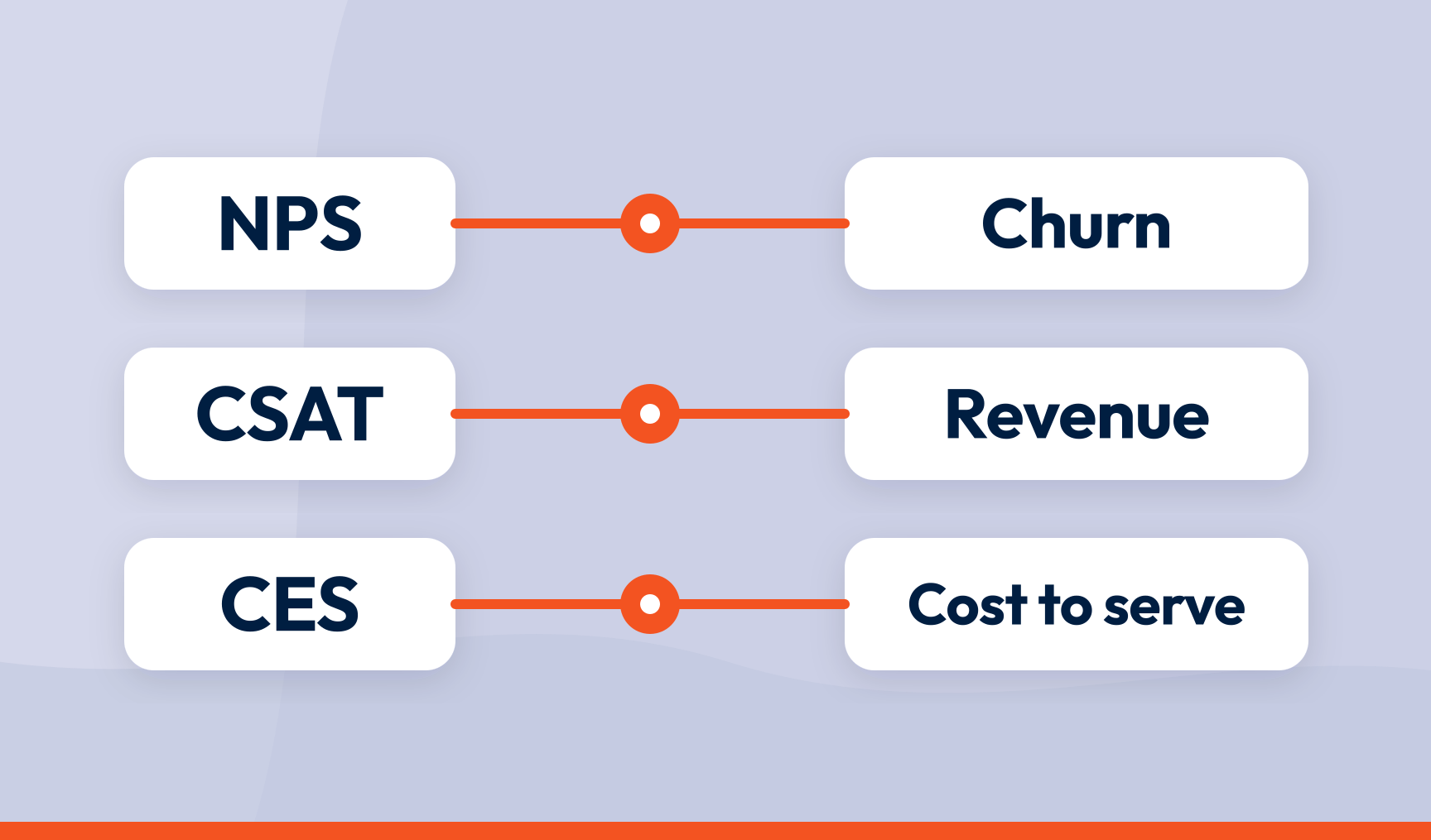
To tie customer experience scores to business KPIs, connect each response to the customer record behind it, find which experience drivers move the score, and track those drivers against retention, revenue and cost to serve over a defined time window. Then report the CX score and the business KPI on the same page. A score that lives in its own dashboard is a score nobody is going to fund.
Key takeaways
- CX scores are leading indicators. Revenue, churn and cost are lagging ones. Linking them is how you get early warning
- The link runs through drivers, not scores. ‘NPS moved’ proves nothing. ‘The delivery driver moved and churn on that cohort followed’ does
- Start from the business KPI that’s underperforming and work backwards to the journey, not the other way round
- Segment everything. A company-wide NPS of 40 can hide a 60 and a 20
- Attach customer metadata to every response, so feedback arrives already labelled with segment, value and journey stage
- Put CX scores and business KPIs in one place, either by bringing revenue and churn data in or by sending CX intelligence out to BI, CRM and ticketing tools
Most CX teams can quote their NPS to the decimal point. Far fewer can say what it’s worth.
That gap, between measuring and meaning, is where programmes stall. Executives want proof that a better experience means more revenue kept, not a prettier chart. This is how you connect the two, and where to put the evidence so people believe it.
Why CX leaders struggle to prove business impact
Linking NPS and CSAT to business outcomes means mapping feedback to hard metrics: customer lifetime value, churn, cost to serve, referral rate. Most teams collect feedback religiously and never get there. McKinsey found only 4% of CX leaders say their measurement system lets them calculate the return on a CX decision.
Three things get in the way.
Silos. Scores in one system, revenue in another, tickets in a third. Correlation across three systems is guesswork with a chart.
Lag. CX scores lead. Revenue lags. A bad experience today is churn next quarter, so when leadership asks for proof, the score has moved and the money hasn’t yet. Handled well, that gap is your early warning. Handled badly, it is the reason nobody believes you.
The missing middle. Teams try to link a score directly to money and skip the step in between. Scores don’t drive revenue. Experiences do. The driver is the link, and most programmes never name it.
What NPS, CSAT and CES measure
| Metric | What it measures | Scale | Type |
|---|---|---|---|
| Net Promoter Score® (NPS®) | Loyalty and likelihood to recommend | 0 to 10 | Relational |
| Customer satisfaction score (CSAT) | Satisfaction with a specific interaction | 1 to 5 | Transactional |
| Customer effort score (CES) | How easy a task was to complete | 1 to 7 | Transactional |
NPS is the portrait: promoters (9 to 10) minus detractors (0 to 6). CSAT is the snapshot: satisfaction with one moment. CES is the one most teams ignore, and they shouldn’t. Gartner found effort is a stronger predictor of loyalty than satisfaction. Customers forgive a lot. They don’t forgive being made to work.
A customer can rate a support call five stars and still be a detractor, because it was the fourth call about the same problem. So you need both layers: CSAT tells you whether touchpoints work, NPS tells you whether the sum of them builds loyalty.
On benchmarks: a good NPS in telecoms might be 30. In hospitality that would be a problem. Your own trend line, and whether the business KPIs move with it, matters more than anyone’s league table.
Which business KPIs to connect CX scores to
Not every KPI links cleanly. Start with the ones finance already owns and CX can plausibly move.
- Retention and churn. The clearest link. Detractors leave faster, and a lost customer has a price on it
- Cost to serve. Detractors phone more and escalate more. The saving lands in the contact centre first, which makes this the fastest KPI to prove
- Lifetime value and upsell. Promoters stay longer and buy more. McKinsey found experience-led strategies can lift cross-sell rates by 15 to 25%. Slowest to show, biggest numbers
- Referral. Every customer a promoter brings in is an acquisition cost you didn’t pay
Start from the KPI, not the score
Here is the change in habit that makes the rest work. Most CX programmes start with the score and hunt for a business outcome to attach it to. Reverse it.
Pick a business KPI that is underperforming. Say 90-day churn on one product line. Ask which journey most plausibly drives it. Collect feedback at the stages of that journey. Run key driver analysis to find which experience themes move the score at those stages. Now you have a chain: business KPI, journey, driver, score. Fix the driver and you can watch the chain move in both directions.
Starting from the KPI also changes which problems you choose to solve. You stop fixing the loudest complaint and start fixing the one that costs money.
How to correlate CX scores with revenue and retention
1. Connect feedback to the customer record
A score on its own tells you nothing about business impact. Join every response to the CRM record, billing history and support history behind it. Without that join, you are analysing scores in isolation and calling it insight.
The practical way to do this is metadata. Every response should carry the attributes you will want to slice by later: customer ID, segment, value tier, tenure, product line, region, journey stage, contract renewal date. Some of it comes from the survey itself. Most of it should be pulled in from your CRM or billing system and attached to the response at the point of collection, so the feedback arrives already labelled. Metadata is a data source in its own right. Treat it like one.
2. Set the time window before you start
How long after a score change should you expect to see an outcome? For churn, 30 to 90 days. For CLV, 6 to 12 months. Decide in advance, or you will find a window that fits whatever story you wanted to tell.
3. Find the pattern
Do customers who rated support 5 out of 5 retain better than those who gave a 3? Do accounts whose driver sentiment turned negative in Q1 churn more in Q2? Basic correlation finds patterns intuition misses.
4. Control for everything else
Price changes, competitor moves, seasonality. All of them move revenue with no help from you. Compare cohorts within the same period so the outside world is held constant.
5. Validate by cohort
Compare outcomes for promoters, passives and detractors over time. If the relationship holds across cohorts and not just in aggregate, you have something you can defend.
Segment, or the average will lie to you
A company-wide NPS of 40 can be enterprise customers at 60 and small business customers at 20. Report the 40 and you will fix the wrong thing.
- By journey stage: are you losing people at onboarding or after three years?
- By product line: which one drives satisfaction and which one drives complaints?
- By channel: is the app dragging the score down while chat quietly props it up?
- By customer value: a detractor spending £10,000 a year is not the same problem as one spending £100
None of these cuts is possible without the metadata from step one. If the response doesn’t know which product line or value tier it belongs to, neither do you.
Segmentation is also where the positive side shows up. A journey stage with unusually high scores is telling you what to protect and what to copy elsewhere. Those signals are under-reported, because people rarely write in to say something went well, so a small cluster of praise usually means a much larger group noticed.
Transactional and relational metrics: use both
Deploy CSAT and CES immediately after specific interactions. They create tight loops for operational teams and they tell you where in the journey the problem lives.
Use NPS as the periodic health check. Quarterly or twice a year is enough. It captures the cumulative effect that no single touchpoint survey can see.
Then connect them. Feedback collected across the journey should feed the relational picture, and both should sit against the business KPIs. A touchpoint fix that lifts CSAT, then lifts NPS, then lifts retention is the full chain, and you can only see it if the three layers are in the same place.
Best practices for linking CX scores to business outcomes
Run both loops
The inner loop is reactive: a detractor scores you a 2, the case goes to someone who can fix it, the customer stays. It saves individuals.
The outer loop is where the KPI moves. Driver analysis finds why detractors are detractors, the root cause gets fixed, and the complaints stop arriving for customers who never gave feedback at all. It also finds what promoters praise, so you can do more of it. The inner loop protects this quarter’s revenue. The outer loop protects next year’s.
Alert on movement, not on schedule
A drop in NPS today is churn in 90 days. That window is only useful if someone hears about it this week, not in the quarterly review. A driver turning sharply negative should reach the owning team the day it happens.
Put the evidence where the business already looks
This is the part that makes or breaks all of the above.
If CX scores live in a CX tool, only the CX team looks at them. Everyone else gets a slide, quarterly, with the context stripped out. There are two ways to fix it, and good programmes do both.
Bring the business data in. Connect your CRM, billing and support systems to the platform where feedback lives, so revenue, churn and contract data sit alongside the scores and drivers. Then build the dashboard that answers the question the board actually asks: this is the driver, this is the score it moved, this is the churn on that cohort, on one screen. If the integration exists, this is a configuration exercise, not a project.
Send the CX intelligence out. Push driver trends, detractor rate by journey stage and CSAT by touchpoint into the reporting layer the business already uses. Power BI next to churn and revenue. The CRM, so account managers see a driver turning negative on the accounts they own. The ticketing tool, so the fix has a case number. Same page, same meeting.
Integrations are the plumbing for both directions, and they should be unremarkable. The result is what matters: feedback turned into CX intelligence the whole business can act on, sitting alongside the numbers it explains. And when the fix ships, the driver moves and the KPI follows, everyone sees the same three lines on the same chart. ‘NPS is up five’ becomes ‘the delivery driver improved and churn on that cohort fell 8%’, which is how you prove impact without a presentation.
From feedback to measurable business performance
Linking CX scores to business KPIs is a capability, not a one-off analysis. It takes three things: feedback joined to the customer record, driver analysis to find the missing middle, and the whole chain reported where the business already looks. Get those right and the CFO stops asking what the score is worth, because the answer is on the dashboard.
That’s what SmartCX is built for: joining journey feedback to your CRM and revenue data, ranking the drivers, and putting the result in a custom dashboard or straight into Power BI, Salesforce, HubSpot and the other tools your teams already work in. See it in our product tour.
Frequently asked questions
What is the relationship between CSAT and NPS?
CSAT measures satisfaction with one interaction. NPS measures overall loyalty. A customer can rate individual transactions highly and still be a detractor because of the cumulative experience. Use CSAT to find which touchpoints are failing and NPS to see whether the sum of them builds loyalty.
How long does it take for a CX score change to affect business results?
Typically one to several quarters, depending on your purchase or renewal cycle. Churn and cost-to-serve effects appear first, usually within 30 to 90 days. Revenue growth and lifetime value effects take 6 to 12 months. Set the window before you run the analysis.
Can customer effort score be linked to business outcomes?
Yes, and often more tightly than satisfaction. Low-effort experiences correlate strongly with repeat purchase and reduced churn, and high effort predicts both defection and higher support cost at the same time.
How do you prove a score change caused a business result rather than just correlating with it?
Link the score to a specific driver, link the driver to a specific fix, and compare the cohort that experienced the fix with one that didn’t, in the same period. Attribution to a named initiative is what separates a correlation from a case.
SmartCX is the VoC platform that helps you turn feedback data into CX intelligence the whole business can act on. Watch the product tour or talk to us about connecting your CX scores to the KPIs your business already reports.