
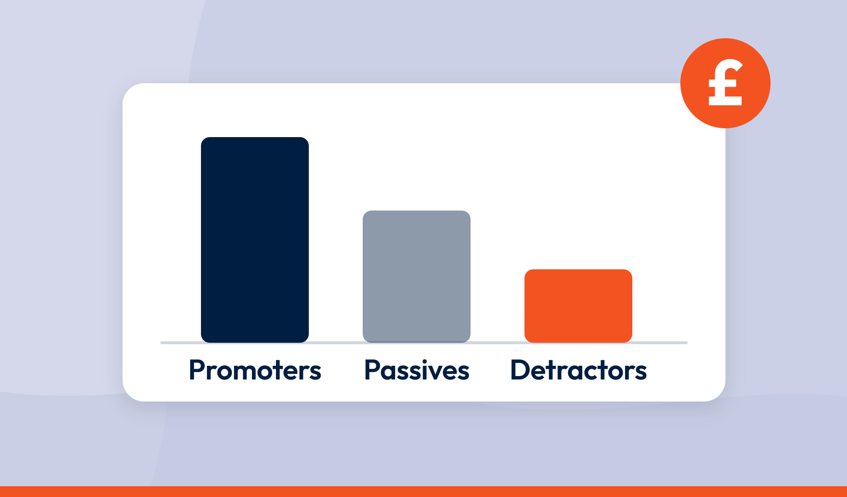
To calculate the revenue impact of Net Promoter Score® (NPS®) improvements, split customers into promoters, passives and detractors, work out what each group is worth in spend, retention and referrals, then model the revenue that shifts when customers move between groups. That gives you the size of the prize. It doesn’t tell you how to win it.
Key takeaways
- Promoters, passives and detractors are worth different amounts, and a blended average hides the gap you are trying to value
- Revenue impact is the gap between segments multiplied by the customers who move, with a lag of one or two purchase cycles
- NPS is a leading indicator: it moves before revenue does, which is the whole point of it
- The number is only useful if it points to a driver worth fixing or a good experience worth repeating
- The people who scored you are a sample, and most of the customers your model describes never said a word
Your NPS went up eight points. Nice slide. Green arrow. Round of applause.
Then finance asks what eight points is worth. The room goes quiet. There’s a formula for that.
But there’s a harder question coming, and it’s the one that matters. Which of the things you did caused the eight points? A revenue figure with no answer to that is a very expensive way of saying ‘well done’.
Why a revenue number on its own earns you nothing
Revenue attribution means tracing a change in an experience score to a financial outcome. Customers kept. Spend grown. Churn avoided.
The trap is treating the sum as the finish line. Anyone with a spreadsheet can produce ‘a five point lift is worth £1.2 million’. Finance nods. Nothing changes. The number named an outcome and not a cause.
Remember what NPS is. It’s a leading indicator. A customer who scores you a 3 in March is still paying you in March. They stop in September. That gap is your window to act.
So do the calculation. Just know what it’s for. It’s the argument for fixing the experiences that move the score, and the yardstick for whether the fix worked.
What the evidence says about NPS and revenue
Bain & Company, who invented the metric, report that NPS leaders grow at more than twice the rate of their competitors. A London School of Economics study put it at roughly 1% extra revenue growth for every seven point NPS rise.
Both are correlations across lots of companies. Neither is proof of what will happen in yours. Build your own model.
The mechanism isn’t mysterious.
- Retention: promoters renew; detractors leave, usually without telling you
- Wallet share: happy customers upgrade, add products and buy more often
- Referral: promoters bring in customers you didn’t pay to acquire
- Cost to serve: detractors generate complaints, escalations and win-back calls, and none of it is free
That gap is your revenue impact. Measure it, then close it.
The data you need before you start
The classic failure is being three quarters through a model and realising you never had churn by segment. So, first:
- Revenue per customer, by segment. Average revenue per user (ARPU) or customer lifetime value (CLV), split by promoter, passive and detractor. A company-wide average is worthless here. The gap is what you’re valuing, and the average erases it
- Retention and churn, by segment. Detractors churn faster. How much faster is the number that drives everything. Take customers by their score at a point in time and follow them for 12 months
- Referral rate and acquisition cost. Every referral is a customer acquisition cost (CAC) you didn’t spend
- Where in the journey the score was given. The input most models skip. A score after onboarding, after a support call and at renewal are three different facts. Collect feedback across the journey and your model can say not just what a detractor costs, but where you made them
How to calculate the revenue impact of NPS improvements: four steps
Step 1: segment
9 to 10 are promoters. 7 to 8 are passives. 0 to 6 are detractors. Keep them apart the whole way through. And don’t ignore passives just because they aren’t shouting. They’re usually your biggest pool of movable customers.
Step 2: put a value on each segment
| Segment | Average annual revenue | Retention rate | Referral rate |
|---|---|---|---|
| Promoters | £12,000 | 95% | 15% |
| Passives | £8,500 | 82% | 3% |
| Detractors | £6,000 | 70% | 0% |
Your numbers will differ. The shape won’t. Promoters win on all three at once, and the effects compound.
Step 3: model the shift
If you convert 100 passives into promoters, what changes? Run a one, five and ten point scenario, each moving a share of customers between segments. Stopping detractors leaving and turning passives into fans are different jobs, worth different amounts.
Step 4: net revenue impact
Net revenue impact = projected revenue after the improvement − baseline revenue
From the table, 100 detractors becoming promoters is £6,000 more each on spend alone. £600,000 a year, tied to a specific movement in the score. That’s a sentence finance can put in a plan.
Revenue at risk and revenue to win
Detractor churn risk
Detractors × average revenue × churn probability. 500 detractors at £6,000 with 30% churn is £900,000 leaving the building. This is your most persuasive number. It’s a loss you can stop, not a gain you’re promising.
Promoter referral value
Referred customers × their lifetime value, plus the CAC you saved. 50 referrals at £10,000 CLV and £500 saved CAC each is £525,000 that never shows up on a marketing dashboard.
Passive conversion
Satisfied enough to stay, not enthusiastic enough to tell anyone. Model moving 10% of them. Small shift, big pool, outsized return.
The customers who said nothing
Now the part every model ignores. The people who scored you are a sample.
People complain fast and compliment slowly. If 200 customers wrote in about a billing error, a lot more hit it and just left. And nobody writes to say ‘the delivery came on time, thanks’. Plenty noticed.
Treat every theme as a proxy for a larger silent group. That’s why fixing a root cause is worth far more than the complaints you can count.
From the number to the cause: two loops
The figure tells you the prize. It doesn’t tell you how to collect it. Most programmes stall right here: all arithmetic, no operating model.
The inner loop is recovery. Someone scores you a 2, someone calls them, the problem gets fixed, the customer stays. It moves the score one rescued customer at a time. Necessary, reactive, and never enough on its own. You’re mopping the floor while the tap runs.
The outer loop turns the tap off. It asks why the detractors are detractors. Key driver analysis shows which themes statistically move your score and which just feel important because they’re loud. Journey-stage feedback shows where those drivers happen. Fix the cause and the complaints stop arriving. Fewer detractors next quarter, and nobody had to rescue them.
It cuts both ways. The outer loop also shows what promoters praise, which is under-reported because happy people don’t volunteer detail. Those are your instructions for what to do more of. Doing more of the good thing lifts the score as surely as fixing the bad thing, and it’s usually cheaper.
None of it works if the insight sits in a CX tool nobody opens. Driver evidence goes to the team that owns the fix. Metric movement goes to the dashboard leadership already reads, built in or in Power BI next to revenue and churn. That’s CX intelligence: feedback the whole business can act on, delivered where the action happens. It’s also how you prove impact. Driver fixed, score moved, revenue followed, one page.
Common mistakes when linking NPS to revenue
Ignoring the lag
Retention shows up at renewal. Referrals build over quarters. Put a 6 to 18 month window in your model and say so. Claim instant revenue and you’ll be disbelieved, correctly.
Using averages
A blended CLV of £9,000 tells you nothing about the gap between a promoter and a detractor. No gap, no model.
Mistaking correlation for cause
NPS and revenue moving together doesn’t prove one drove the other. Both might be reacting to a price change. Cohort comparison and driver analysis separate the experience effect from the noise.
Forgetting the outside world
Booms, competitors and Christmas all move revenue without your help. Compare cohorts within the same period, not the same cohort across periods.
Chasing the score instead of the experience
Attach money to a number and people will move the number. Survey only the happy ones. Ask at the moment of delight. Coach for a 10. All of it lifts NPS. None of it lifts revenue, because nothing changed for the customer.
From a number you report to a number you act on
‘NPS is up eight’ is a slide. ‘A five point lift is worth £2.3 million a year, and the top two drivers are checkout errors and delivery delays’ is a decision.
The calculation gives you the size of the prize. Driver analysis, journey feedback and getting the evidence to the right teams are how you collect it.
That’s what SmartCX is built for: taking the feedback you already collect and turning it into CX intelligence your finance, ops and product teams will actually act on. See key driver analysis and journey feedback in action in our product tour.
Frequently asked questions
How long does it take for NPS improvements to show up in revenue?
Usually one or two purchase or renewal cycles, so 6 to 18 months. Subscription businesses see it at renewal. Transactional businesses see it faster if customers buy often.
Can you calculate NPS revenue impact without customer lifetime value data?
Yes, with less precision. Average revenue per user or average transaction value works as a proxy over a shorter horizon. A segmented ARPU model beats no model.
What revenue increase should a company expect from an NPS improvement?
There’s no universal benchmark worth quoting. Moving from 20 to 30 in subscription software behaves nothing like 50 to 60 in retail. Build the model on your own customers, churn and margins. It’s the only figure finance will accept.
How do you isolate the effect of NPS from other things affecting revenue?
Cohort analysis, control groups and time-series comparison. Track customers by their score at a point in time against a matched group. Driver analysis adds the causal layer by showing which experiences actually moved the score.
What is the difference between the inner loop and the outer loop in NPS?
The inner loop is reactive: follow up with individual detractors, fix their issue, keep them. The outer loop is preventive: use driver analysis to find the root causes behind low scores and the reasons behind high ones, fix the first and do more of the second, so the experience improves for customers who never gave feedback at all.
SmartCX is the VoC platform that helps you turn feedback data into CX intelligence the whole business can act on. Watch the product tour or talk to us about how the revenue impact of NPS becomes something you can prove.