Tag
Insights
21 articles
The best way to build a customer journey map is to stop guessing
The best way to build a customer journey map starts with feedback you already hold. Let the stages emerge from what people say, then bring leaders in to react.
CX journey mapping: a guide that starts with what people actually said
CX journey mapping works best when it starts with feedback you already hold. Build the stages from what people say, name owners and keep the map current.
Acting on positive customer feedback: close the loop on what’s working
Most programmes chase low scores and file the praise. Learn how to act on positive customer feedback, repeat what drives it and turn customers into advocates.
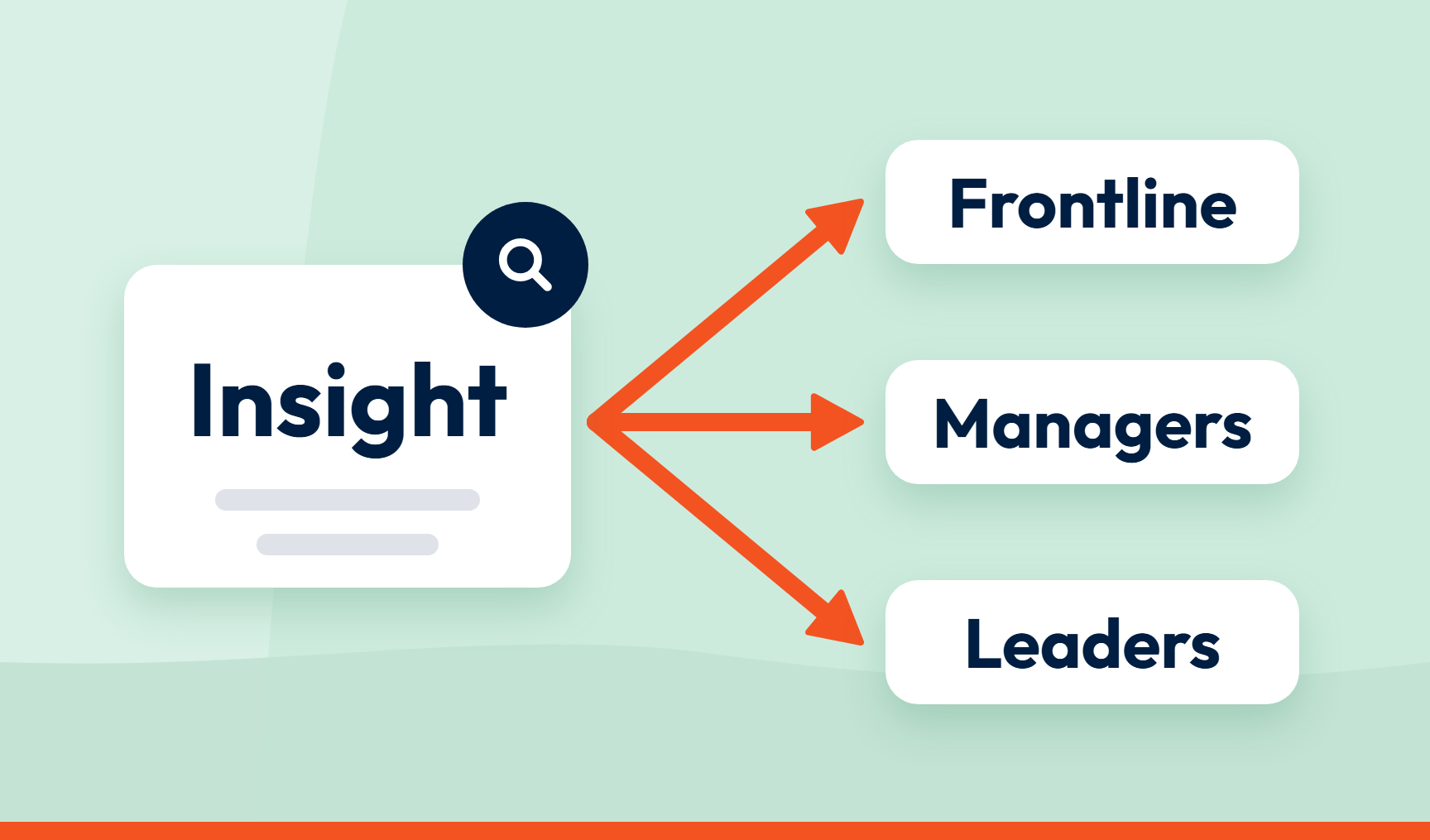
How to share customer insights with the people who can act on them
Different teams need different cuts of the same CX data. Learn who should see what, in which format, and how often, so customer insights get acted on.
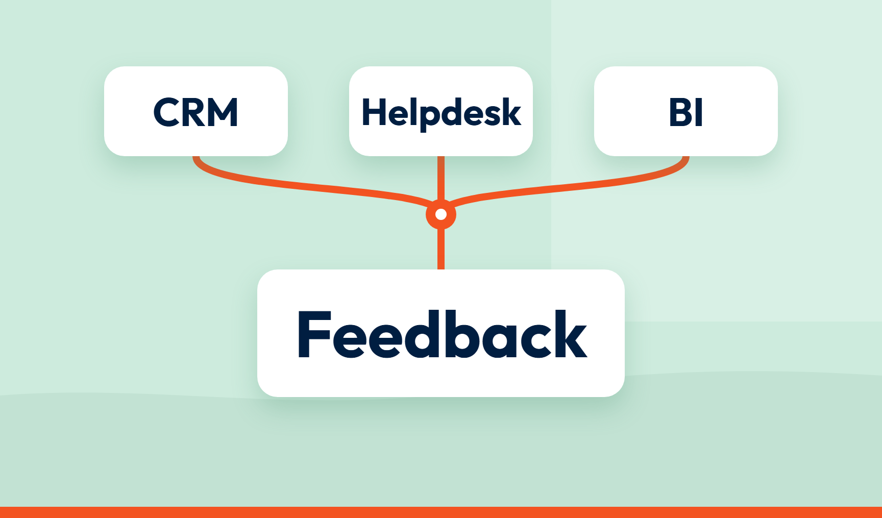
Customer feedback integration: why insights shouldn’t live in a tool nobody opens
Feedback that stays in one tool gets ignored. Learn how to connect customer feedback to your CRM, helpdesk and BI tools so insights reach the people who act.
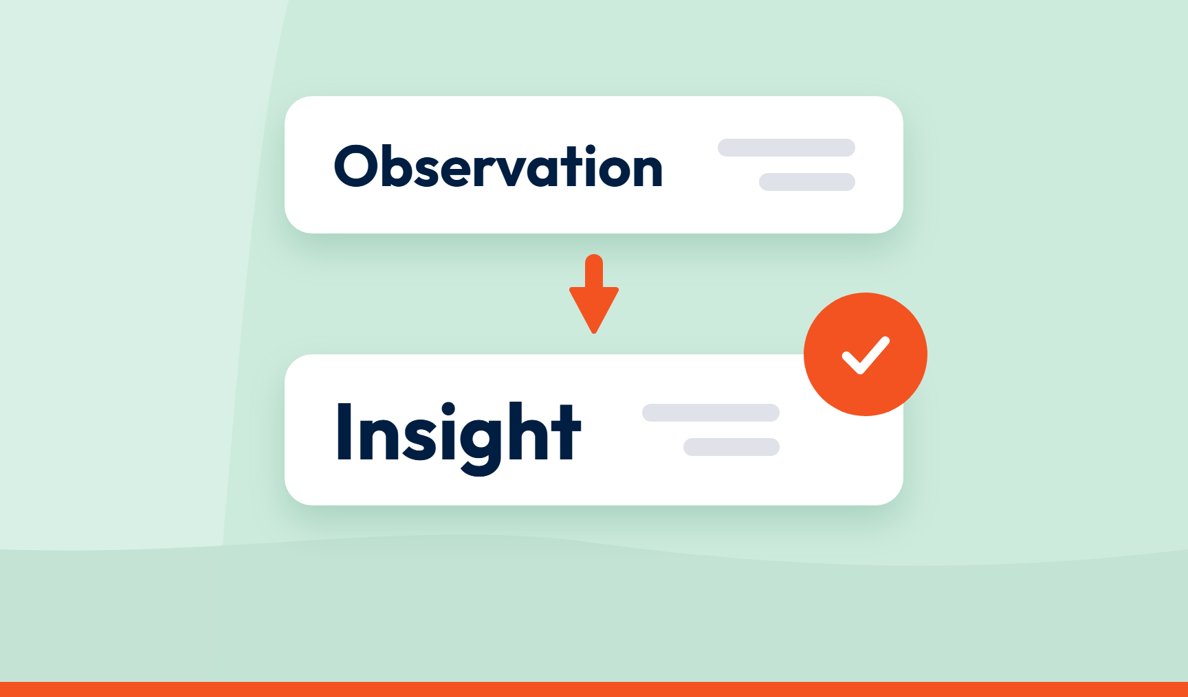
What makes customer insights actionable?
Most customer insights are observations. Learn what makes actionable customer insights specific, evidence-based, owned and easy to act on.
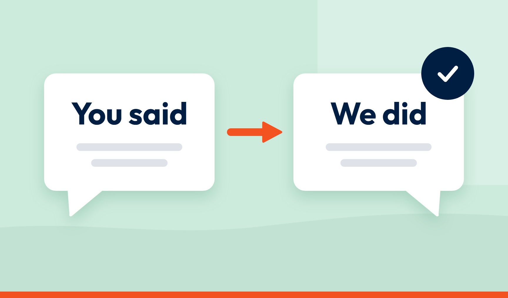
Closing the loop with customers: how to tell them what changed
A thank-you email isn’t closure. Learn the two ways to close the loop with customers: a personal reply, and a “you said, we did” message.

Why did our NPS drop? How to find what’s behind a score change
Your NPS dropped and the score won’t say why. Six steps to check the drop is real, compare drivers between periods and find who is affected before you decide whether to react.

The questions people always ask about AI feedback analysis
Most answers come back to one test: can you open any number and see the words behind it? The questions that come up on every call, answered.
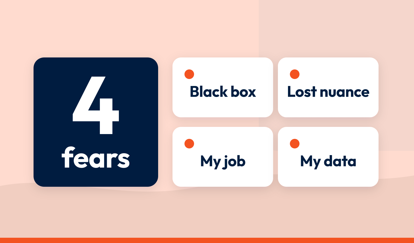
AI adoption in CX teams: the four fears and what to do about them
CX teams’ concerns about AI are about the black box, not the AI. Each of the four fears has a good answer when the platform shows its work.
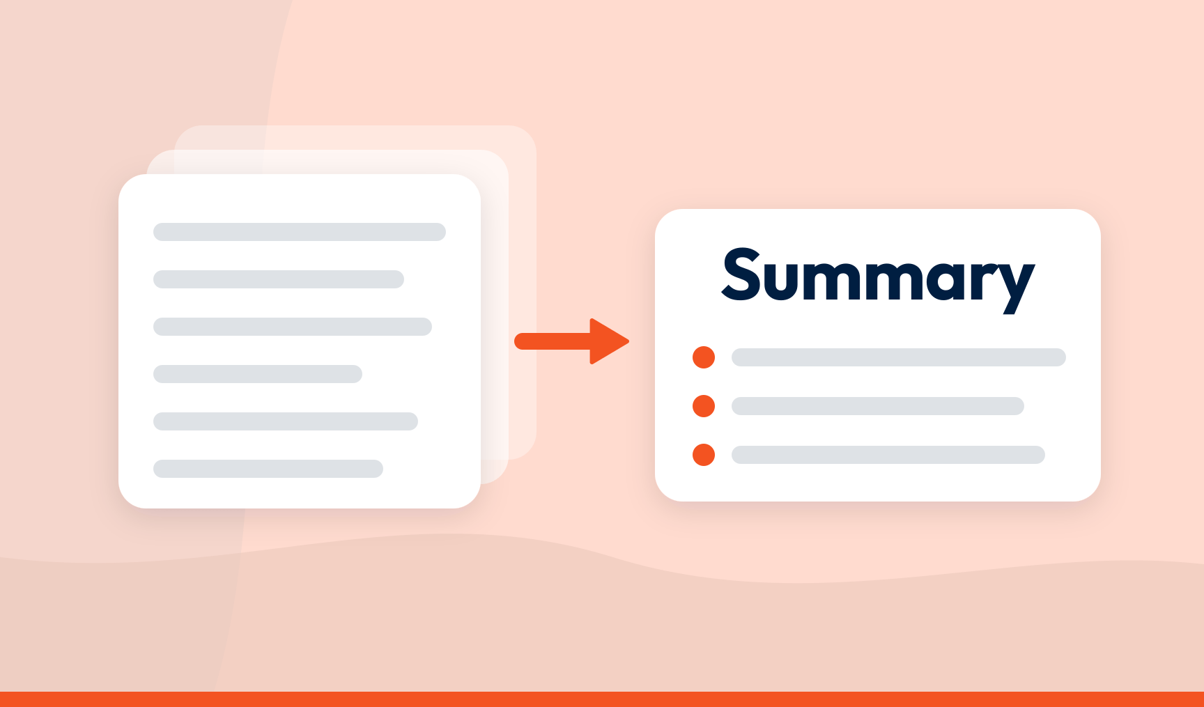
How to summarise customer feedback without losing the point
Structure the feedback first and summarise second. A summary built on stored, scored topics points at what matters, and you can open any claim.
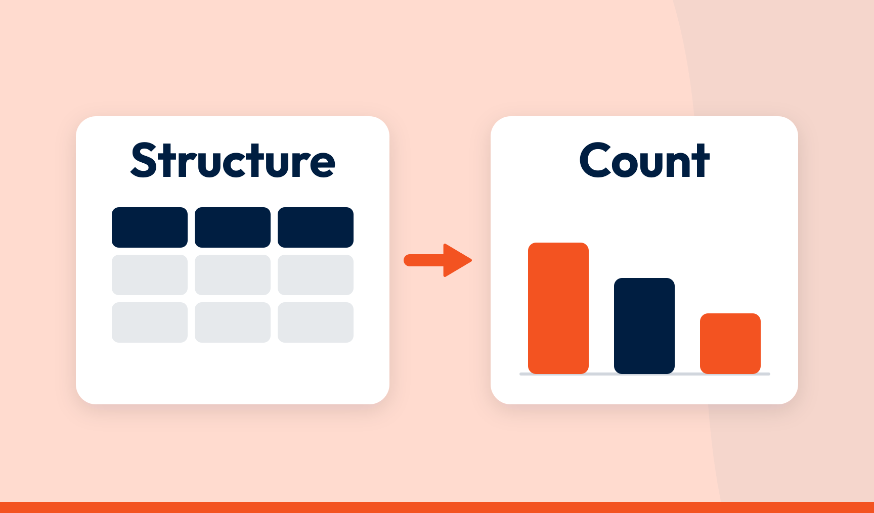
Using Copilot to analyse customer feedback: structure the data first, then let it count
Copilot should not be what structures your feedback. Structure it first, send the data to Power BI or Excel, and let Copilot count.
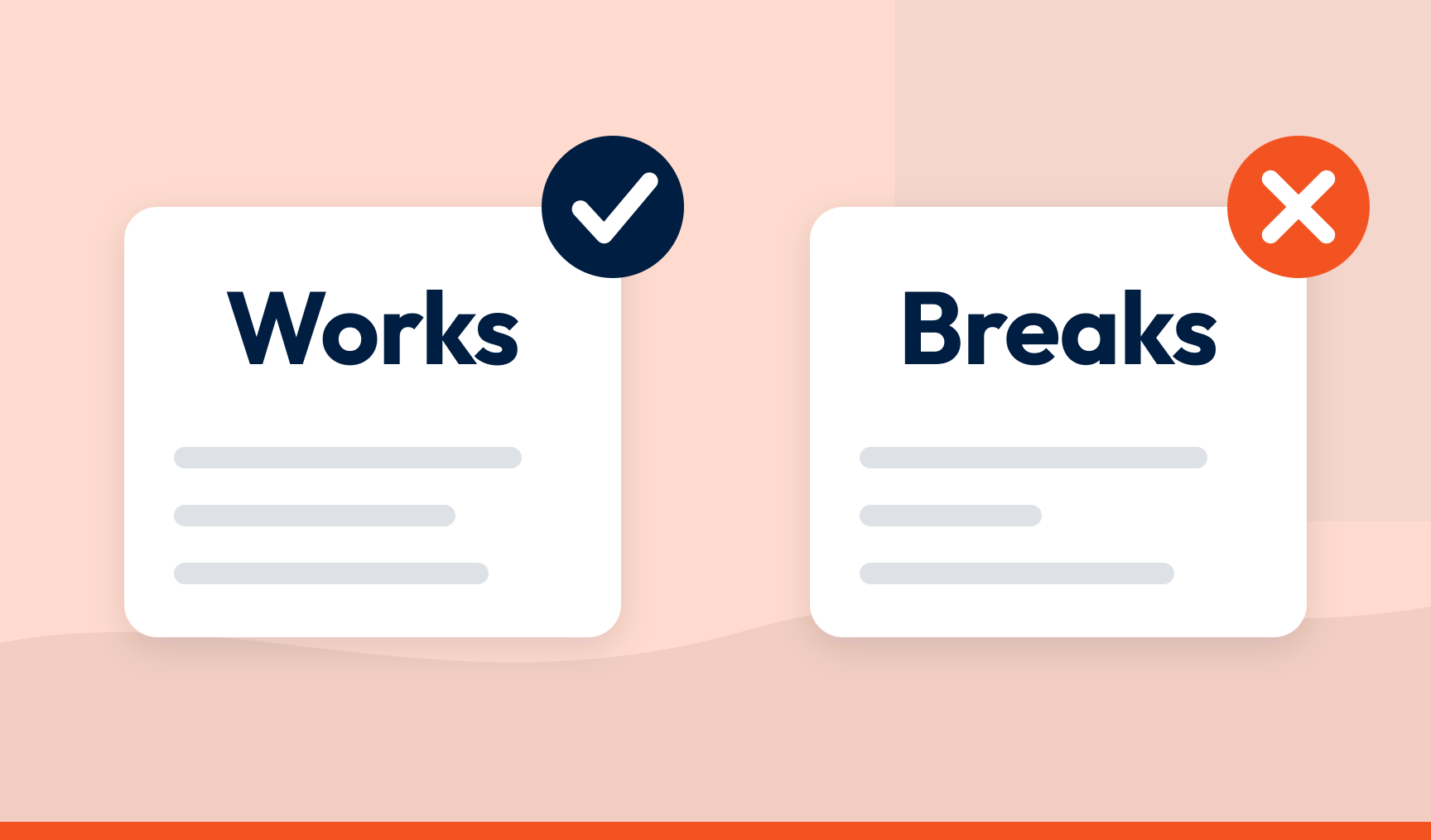
Using ChatGPT to analyse customer feedback: where it works and where it breaks
ChatGPT is good at telling you what feedback says. What you do not get is a dataset: nothing stored, counted consistently or traceable.
How to validate AI insights and turn them into action
Open the finding, read the comments behind it and confirm it says what it appears to say. Then investigate the cause, get the fix to its owner and measure it.
How accurate is AI feedback analysis? The honest answer
There is no right answer to mark AI against. The question you can answer is whether the analysis is consistent, traceable and open to checking.
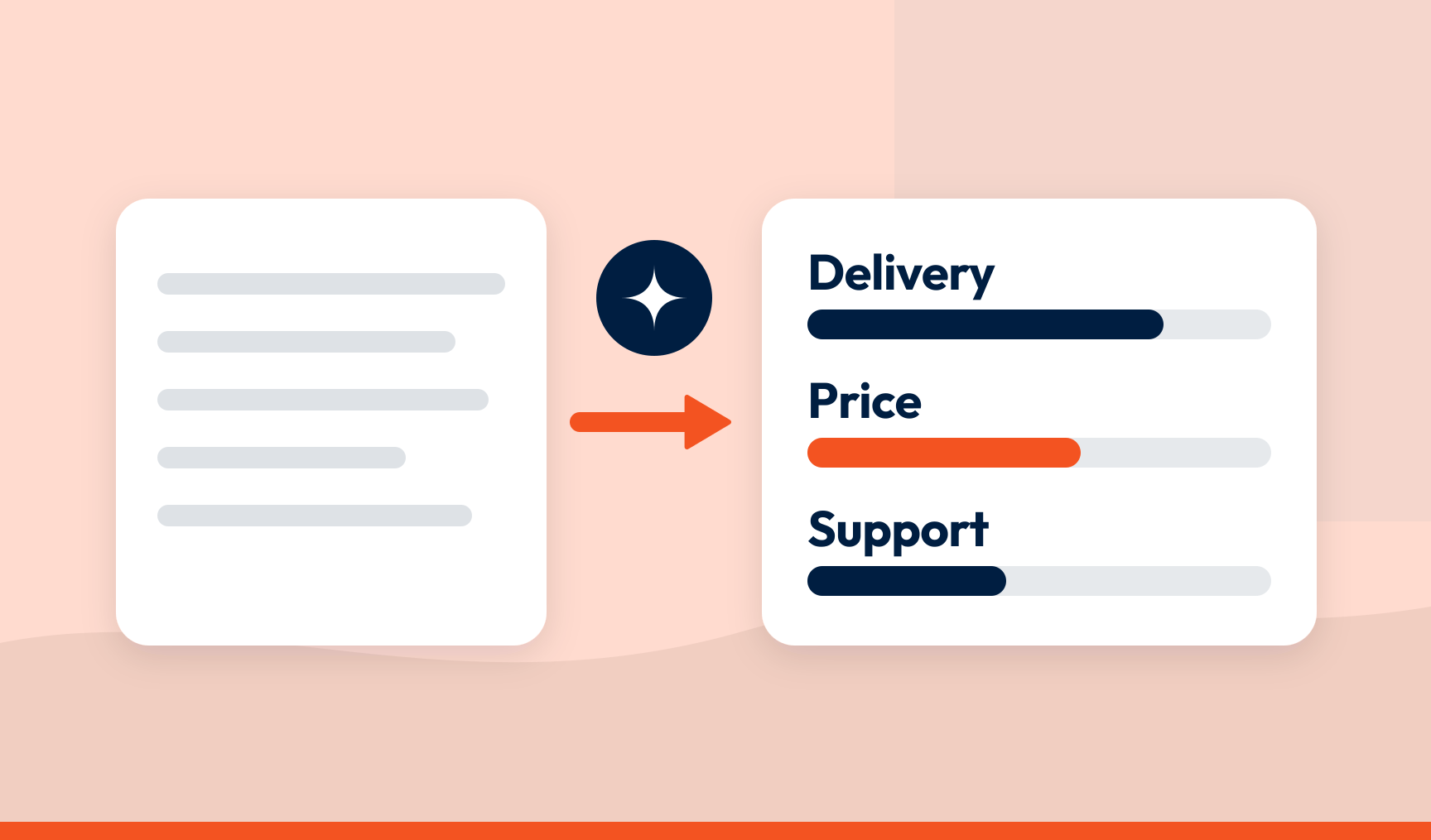
AI text analysis for customer feedback: what good looks like
Good AI text analysis turns every comment into structured data you can count and trace back to the words. Bad analysis just tells you what it thinks.
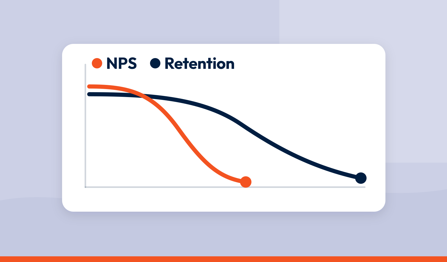
Connecting NPS to retention: a framework that predicts churn before it happens
A company-wide score cannot predict churn. A score joined to the customer record and the reason they gave can, and that is a warning you can act on.
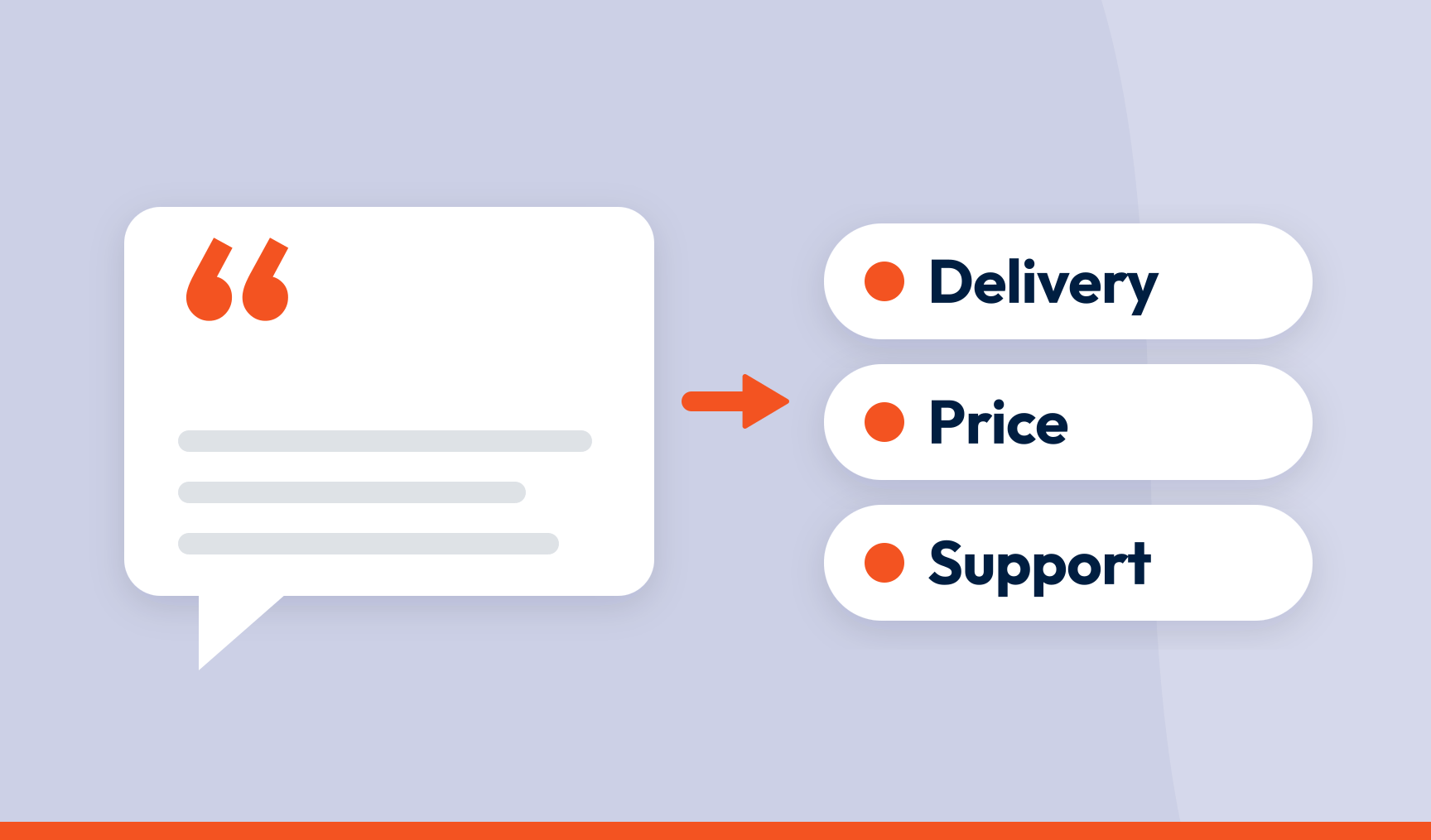
How to categorise NPS open-text responses at scale (without a black box)
Split each comment into what the customer mentioned, score each mention, assign it to one topic and rank topics by how much they move the score.

How to measure customer experience: metrics and methods
Which metric to use at which touchpoint, how to calculate NPS, CSAT and CES, and how to connect what you measure to revenue and retention.
Measuring customer experience: CX metrics you need to know
CSAT, NPS, CES, customer lifetime value, churn and health score — what each CX metric measures, and how to read them together rather than one at a time.
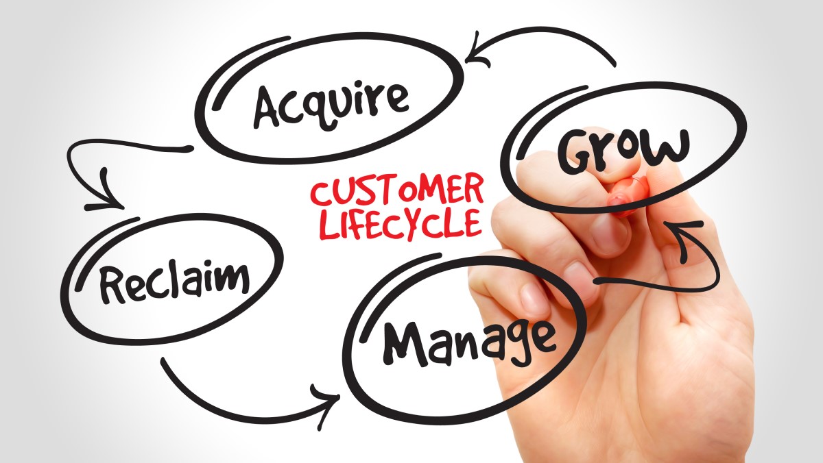
The customer lifecycle: stages, metrics and measurement
Reach, acquisition, conversion, retention and loyalty — the five stages of the customer lifecycle, and the metric that tells you whether each one is working.